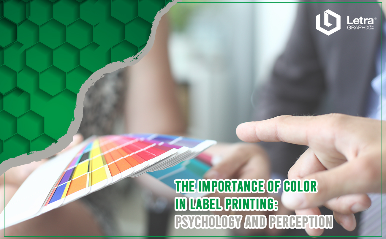
In our colourful world, we encounter a myriad of hues that greatly influence our perceptions. When it comes to label printing, colour psychology plays a significant role in shaping consumer preferences and behaviours.
Consider this scenario: If you’re from the U.S., where brown is commonly associated with chocolate, wouldn’t you be more inclined to choose a chocolate with a brown label over one with a green label?
This example highlights the importance of considering cultural factors, such as nationality, when understanding colour perception. Colour psychology is complex and multi-dimensional, encompassing various factors that impact how individuals perceive different colours.
Let’s delve deeper into the importance of colour in label printing and the role of label printers, exploring the psychology behind it and its impact on consumer perception.
The Psychology of Color
Colour psychology is the study of how different colours affect human emotions and behaviours. Each colour has its unique psychological associations and can evoke specific feelings and responses in individuals.
The Impact on Consumer Perception
When it comes to label printing, colours aren’t just splashes of ink on paper – they’re powerful tools that shape how people see and feel about products. Think about it: Have you ever picked up a product just because the label caught your eye? That’s the magic of colour at work.
Studies have revealed some fascinating insights about the role of colour in label design. For starters, did you know that colour can boost brand recognition by a whopping 80%? It’s true! That’s why businesses put so much thought into choosing the perfect colour scheme – it’s all about creating a visual identity that sticks in people’s minds.
But it’s not just about getting noticed. Colours can also tug at our heartstrings and stir up emotions.
For example, warm, inviting hues might make us feel cosy and comforted, while bright, vibrant shades could spark excitement and energy. These emotional responses can influence how we perceive the quality, value, and trustworthiness of a product. So, when you’re staring at a shelf full of options, the colours on those labels are quietly whispering messages to your brain, shaping your purchasing decisions without you even realising it.
And let’s not forget about practicality! Colour combinations and contrasts aren’t just pretty – they’re essential for making labels easy to read and visually appealing. After all, nobody wants to squint at a jumble of words on a label. By carefully selecting colours and arranging them in just the right way, businesses ensure that important information stands out and grabs your attention, making the whole shopping experience smoother and more enjoyable.
So, the next time you find yourself drawn to a product on the shelf, take a closer look at the label. Chances are, the colours are working their magic on you, guiding your choices and shaping your perceptions in ways you never even realized. It’s amazing how something as simple as ink on paper can have such a big impact on our lives!
The Role of Label Manufacturers and Printers
Label manufacturers and printers understand the importance of colour in label printing and employ various techniques to maximise its impact. They offer a wide range of colour options, printing technologies, and design capabilities to help brands create labels that resonate with their target audience.
At Letra Graphix, we understand the importance of colour in label printing and employ various techniques to maximise its impact. Whether it’s vibrant hues, subtle gradients, or strategic colour combinations, our skilled flexo label makers utilise cutting-edge technology to create visually appealing and durable labels that resonate with our client’s target audience.
With roots deeply entrenched in India and the Middle East, Letra Graphix has earned international acclaim for delivering top-quality label solutions across industries. Our commitment to customer satisfaction, coupled with our cost advantage in the market, sets us apart as a trusted partner for all label printing needs.
When you choose Letra Graphix, you can expect quality that exceeds your expectations, technology-driven perfection, and unmatched customer service. Experience the difference with Letra Graphix – your trusted partner in label printing.
Practical Tips for Choosing Colours That Align With Brand Identity and Target Audience Preferences:
- Understand your brand identity: Consider the personality, values, and messaging of your brand. Choose colours that reflect and reinforce these attributes.
- Conduct market research: Gather insights into your target audience’s preferences, demographics, and cultural associations with colours. Use this information to guide your colour selection.
- Consider colour symbolism: Be mindful of the cultural and psychological meanings associated with different colours. Ensure that your chosen colours convey the intended message and evoke the desired emotions.
- Use colour psychology: Leverage the principles of colour psychology to influence consumer perceptions and behaviours. For example, warm colours like red and orange can create a sense of urgency, while cool colours like blue and green can evoke feelings of trust and calmness.
- Maintain consistency: Establish a cohesive colour palette that aligns with your brand’s visual identity across all marketing materials, including labels, packaging, and promotional materials.
Final Thought
In conclusion, colour is a powerful tool in label printing, with the ability to influence emotions, perceptions, and purchasing decisions. Label manufacturers and printers play a crucial role in harnessing the psychology of colour to create labels that captivate consumers and drive sales. By understanding the impact of colour and leveraging it effectively, brands can enhance their packaging, strengthen their brand identity, and ultimately succeed in the competitive marketplace.


